Kinda unfair, isn’t it?
As a blogger you have so many different skills to master.
Writing, editing, promotion, networking . . . the list goes on and on.
You’re essentially expected to be a solo publishing empire — an entire team of skilled professionals rolled into one person.
Where on earth will you find the time? How do you make the best use of the time you do have?
Tools can help, but let’s face it, researching and learning new tools is a time-suck all of its own.
However, one free tool could make a huge difference to your success as a blogger.
Chances are, you already know about it. You’ve probably even installed it on your blog.
But you’re almost completely ignoring it. And that’s a big mistake.
So what is this neglected power tool? Google Analytics.
And getting it to work for you is a lot easier than you might think.
The Reason Most Bloggers Secretly Hate Google Analytics
Most bloggers hate Google Analytics.
Why? Because it makes them feel dumb.
Maybe you feel the same. You look at the dashboard with all of its tables and figures and charts and you don’t have the first clue what most of it means. You poke around for a few minutes hoping it will all suddenly become clear, then you just shrug and give up.
Let’s face it, you probably didn’t major in data science, and you probably don’t get excited about numbers or data — particularly when you can’t connect them to something you care about.
When you started your blog, you installed Google Analytics because, well, that’s what bloggers do, right? They install Google Analytics because it’s an important and powerful tool.
And that’s where the problem lies. You didn’t install it because you had a specific problem you were trying to solve or a specific question you were trying to answer, you just installed it because other people told you that you should.
Despite the confusion, you still log in every month or so to get a simple overview of how your traffic is growing, but you’re embarrassed to admit that 95% of what the tool has to offer is a total mystery to you.
Why Understanding Your Analytics Is the Best Present You Could Give Your Blog
You may have heard the saying “you can’t manage what you don’t measure.” Imagine trying to manage your personal finances without having a clue what you’re spending — or even what you’re getting paid!
It’s the same with growing a blog. You can’t do it effectively without understanding your audience and their behavior. And the key to understanding that is analytics.
Whatever your blogging goal, whether it’s growing your personal brand, trying to ditch the 9-to-5 job, or just sharing your love of a favorite hobby with as many people as possible, Google Analytics can unlock the answers you need to achieve that goal.
While it might seem overwhelming at first, gaining a working knowledge of Google Analytics is not nearly as hard as you might think. You feel daunted because it’s a general-purpose tool, built to accommodate websites of all shapes and sizes in all niches. The key to making it work for you is knowing what metrics are important to you as a blogger, and which you can simply ignore.
The insights that can be gained from Google Analytics could make a huge difference to the success or failure of your blog because it can tell you exactly where you should be spending your limited time to have the greatest impact.
For example, if you run a video game blog, you might never discover that your readers love action games but don’t care for strategy games without the insights gained from analytics.
Demystifying the Google Analytics Dashboard
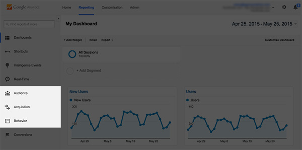
Now that you know about the potential power of Google Analytics for bloggers, let’s dive right into the dashboard and learn where to focus your attention.
The main navigation is on the left-hand side of the screen, where you’ll see eight different options: Dashboards, Shortcuts, Intelligence Events, Real-Time, Audience, Acquisition, Behavior and Conversions.
Right off the bat we’re going to ignore all but three of these options: Audience, Acquisition and Behavior. So that’s more than half the possible options eliminated right away. Feeling less overwhelmed?
The other options obviously have their purpose but they aren’t critical to the success of your blog, at least not in the beginning. (Conversions is powerful but requires careful setup and is more of an advanced option to be discussed in another post.)
By focusing only on Audience, Acquisition and Behavior, you’ll be able to understand who is reading your content, how they’re finding your blog and what pages they’re visiting.
So let’s explore those sections in tandem with some critical questions you should be asking yourself as a blogger.
AUDIENCE — Tells You Who’s Already Reading Your Blog
The Audience section of the dashboard provides information about the people visiting your blog — geographical data such as location and language, technical data such as device type, and also some basic behavioral data.
So let’s look at some useful questions that the Audience section of Google Analytics can answer for you.
Q1: Where in the world are my readers coming from?
Understanding where your readers live can be very powerful, especially if you’re targeting people within a specific geographical area.
For instance, if your blog is about the L.A. nightlife scene you might have a problem if most of your visitors are coming from New York City.
Likewise, if you discover that a significant portion of your visitors come from outside the U.S., that might influence the way you write, perhaps by making sure that you avoid references only a U.S. audience would understand.
To find out where in the world your readers are coming from, you can navigate to:
Audience > Geo > Location
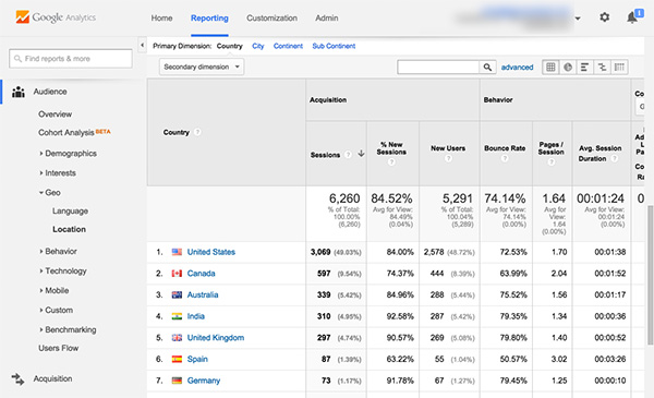
You will likely find two “dimensions” for viewing location data to be the most interesting: Country and City.
Keep in mind that you’ll almost always see traffic from other countries and cities outside of your target geographical location (if you have one), and that’s fine. Just pay attention to where the bulk of your audience is coming from and also any other areas that are responsible for a significant proportion of your visitors.
Note that all of the Analytics reports described in this post can be filtered by Date Range — see the top right of the Dashboard. Unless you are deliberately looking to analyze data for a specific period — e.g. the day of a launch — you should aim to include at least the last 30 days of data.
Q2: How are people accessing my blog?
How does your blog perform on mobile devices? Have you even checked? Because increasingly, that’s how people will be accessing your content.
Google recently announced that mobile searches have officially surpassed desktop searches. We’ve been hearing for years that the mobile age is coming, and now it’s officially here.
To find how your blog’s traffic is split across desktop, mobile and tablet users, navigate to:
Audience > Mobile > Overview
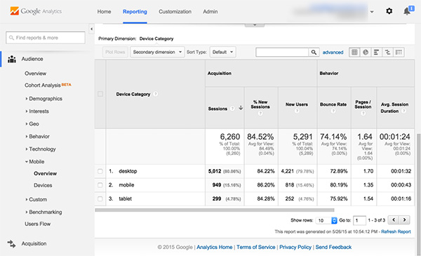
If you click into the Devices section you’ll even be able to see the top devices by brand/model that readers are using.
Why is this useful? If a big chunk of your audience is reading your blog on iPads, you’d be wise to check that your blog looks great on that platform or too many of your visitors may bounce.
If a significant percentage of your readers want to access your blog from their phones, you’ll want to make sure your blog visuals don’t degrade on a small screen. Use Google’s Mobile Friendly Test tool to simulate your site’s performance on mobile and find out.
You can easily look for clues that your blog is unfriendly to users on certain platforms by using the Device report. Look at the following metrics:
- Bounce rate — the percentage of single-page visits (i.e., visits where the person arrived at your blog and left again without further interaction)
- Average session duration — how long a reader typically stays on your site before leaving
- Pages per session — the average number of pages viewed during a session
These metrics should remain pretty consistent across device type. If you’re getting a significantly higher bounce rate for one particular device or device type, or a lower session duration or pages per session, you’ll want to do some investigation to find out why.
Q3: How many readers are coming back for more?
Bloggers talk a lot about reader loyalty, but an abstract concept like loyalty can be tough to measure.
Unless, of course, you’re using Google Analytics. The Audience section of the dashboard distinguishes two types of visitors — new visitors and returning visitors.
You need to consistently attract new readers to expand your audience, but you also want to make sure your existing audience returns for more.
There are a couple of ways to find out how many readers are coming back to your blog. The easiest way is to check out the main Audience > Overview page, where you’ll see a pie chart showing new versus returning visitors.
For a more in-depth look at how each type of reader is using your site, navigate to:
Audience > Behavior > New vs Returning
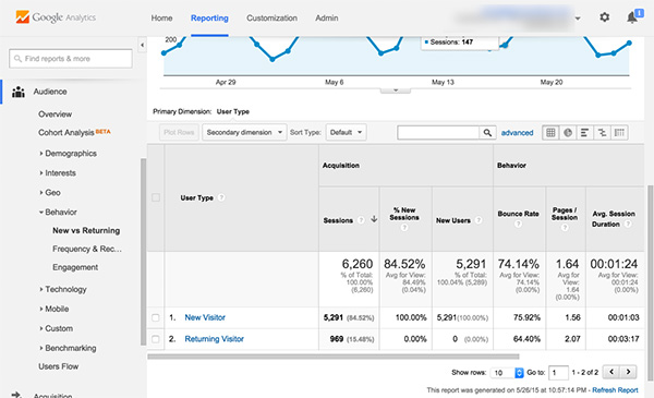
In this view you’ll see a breakdown by type including number of visitors, bounce rate and session duration by type.
If your blog is new, you’ll most likely see a high percentage of new visitors. Over time as your audience grows — and as you build an email list to drive them to your latest content — you should see those numbers start to balance out.
Q4: How long are readers sticking around on my site?
Another broad measure of success that bloggers are interested in is engagement, and again this can be difficult to quantify.
But Google Analytics has a metric you can directly correlate to how engaging your content is to your readers — session duration. This is simply a measure of how much time readers are spending on your content before bouncing away. The less time people are spending on average, the less engaged they are.
You can get a high-level view of session duration by navigating to:
Audience > Behavior > Engagement
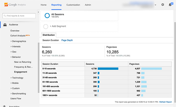
From here you’ll see the breakdown of overall session duration data for your whole site.
Most new visitors will spend a relatively short amount of time on your blog — that’s just the nature of the web. But if you don’t have at least, say, 10% of your sessions lasting 60 seconds or more, you may have an issue with your content from an engagement perspective. (It will vary from niche to niche, but 10% is a good baseline.)
However, rather than looking at your blog as a whole, it’s most beneficial to find out how long readers are sticking around on a post-by-post basis. We’ll do that later in this post.
ACQUISITION — Tells You Where Your Traffic Is Coming From
Visitors can arrive at your blog in numerous ways. For example, they could find you via a Google search, by clicking a post shared on social media, by following a link from another site, or even by typing your blog URL directly into their browser.
The Acquisition portion of Google Analytics tells you how visitors came to be on your blog. And the best part about this section is that you’ll uncover more and more about your blog’s performance the deeper you go.
So what questions can we answer here?
Q5: What’s my best source of traffic?
Google Analytics refers to the ways that visitors can end up on your blog (e.g., via Google Search, social media, etc.) as traffic sources.
To get an overview of the various traffic sources and how they contribute to the traffic your blog receives, you can navigate to:
Acquisition > All Traffic > Channels
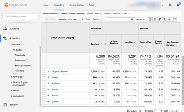
Here’s a quick overview of the main traffic sources you might see:
- Organic Search. This is the term for traffic you receive when someone clicks on a normal search result (not a paid link.)
- Paid Search. This is traffic from paid Google AdWords ad campaigns, i.e., searches from display ads. Note: this section won’t show up unless you are running an AdWords campaign and have synced Analytics with AdWords.
- Social: This is a relatively new feature of Google Analytics that segments your traffic by social source. Be aware that not all social traffic is filtered through this area, though — sometimes you’ll see social traffic in your referral section.
- Referral: This is traffic that came to your site by way of a visitor clicking a link on another website. If you do a lot of guest posting, this is the section you’ll want to check out!
- Direct: This is the traffic you get when a reader either directly types your URL into the address bar of their browser or follows a saved browser bookmark. As your blog grows and you gain repeat visitors, you should see this number climb.
For the typical blogger, the most interesting sources are usually Organic Search, Social and Referral.
Broadly speaking, Organic Search tells you how much Google loves your content, Social tells you how much people on social media love your content, and Referral tells you how much other bloggers and sites love your content (because they link to it.)
When comparing each traffic source, you can also drill down and look at some of the metrics we’ve already discussed, such as bounce rate, pages per session and average session duration, as these can yield further insights.
If you have a particularly high bounce rate for traffic from Organic Search, for instance, it might mean your content isn’t optimized for the right keywords.
A low session duration for Social might mean your content needs to be more visually engaging to capture the attention of people arriving from that fast-paced environment.
Q6: What’s my best-performing content for each source?
As a blogger you’ll want to know which posts are performing well compared to others so you can adjust your future content and promotion strategies accordingly.
And what’s interesting is that content will perform differently depending on the traffic source.
For instance, a new post that goes viral on social media will obviously perform well on the Social metric but will receive no traffic from Organic Search until it has been indexed and starts to climb in the search rankings.
The Acquisition section of the dashboard holds data that can help you understand what content on your blog is performing best for each of the various traffic sources.
From the same Channel overview page under the Acquisition section, click into the traffic source of your choice (e.g., Organic Search) and set your Primary Dimension to “Landing Page.”
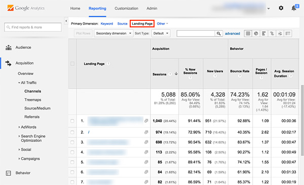
You’ll see all of the same engagement metrics as on the overview page, but now it will be broken up not only by traffic source, but individual page as well.
BEHAVIOR — Tells You How and Where Readers Are Spending Their Time
The first two areas of Google Analytics — Audience and Acquisition — gave us valuable insights about who is visiting your site and how they came to be there. The final area we’ll explore — Behavior — tells you how they interact with your content once they’ve arrived.
By analyzing the behavior of your readers, you’ll be able to identify your “golden” content that is getting the best response and any poor content that may need to be rewritten or redesigned.
So let’s look at some questions that the data in the Behavior section can answer.
Q7: What content do readers love the most?
Earlier we looked at overall reader engagement via the session duration metric.
But as mentioned above, rather than looking at your blog as a whole, it’s most beneficial to learn how long readers are sticking around on a post-by-post basis. By figuring out which topics have above-average session durations, you can work out which ones your readers are enjoying most.
So let’s dig in and do some of that page-level analysis.
Navigate to Behavior > Site Content > All Pages and sort by Average Time on Page (by clicking on that column header so that a down arrow appears.)
Once you have all of your data pulled and sorted, you’ll easily be able to see what your best-performing posts are from a pure engagement standpoint.
You can export this data into a CSV file and open it in Excel or Google Sheets for more flexibility. It’s easier to sort through, and you can remove irrelevant columns and rows, make comments and save it for future use.
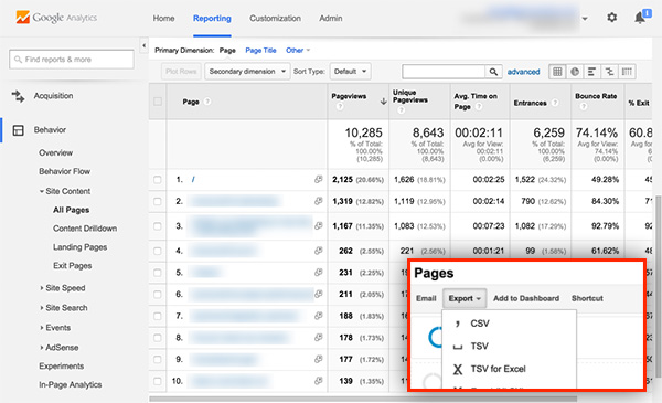
In fact, if you want to go a step further, you can add social metric columns (e.g., shares, tweets, etc.) — you can quickly get this data from Buzzsumo. Now you have some real insights about which posts your audience likes reading — and sharing.
Next, you could add a Topic column to group similar content together into topical buckets. This allows you to easily see which types of posts your audience likes reading about the most, so you can go write more posts on those topics!
Q8: What content is most likely to make readers bounce?
It’s inevitable that your readers will leave your blog for one reason or another; we just have to accept that.
But you want to be sure they are leaving for normal reasons, and not because your content is boring or because your design makes it difficult to discover the next post to read.
In Google Analytics, the last page a person visits before leaving your blog is called the exit page.
To see a report about this, navigate to:
Behavior > Site Content > Exit Pages
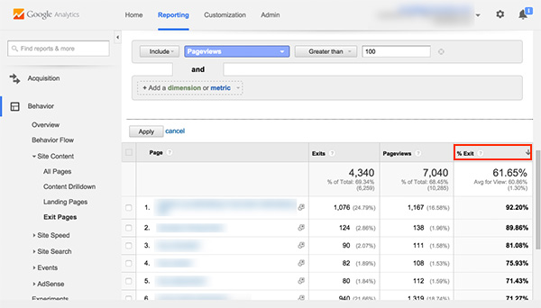
From here you’ll see a table of top exit pages — start by filtering the “% Exit” column for a better view.
Since this table is showing all of the pages on your site, you’ll probably want to filter out pages that have a low pageview count to ensure you’re concentrating on those that get a reasonable number of visits. You can do this by setting an advanced filter to include only pages that have more than a certain level of pageviews.
Now you’re going to want to look for pages with a high exit rate. In my experience, 45-50% is an average exit rate, meaning it’s performing “okay.” Anything under 45% is good. Anything above 50% may merit further investigation.
People might exit your site on a specific page for a number of different reasons, both good and bad.
If you have a high exit percentage on a conversion-oriented page like a sign-up form or a contact page, that could be a good thing.
But if your core posts have high exit percentages, that is a cause for concern. Generally this happens because of poorly developed content, confusing design elements, or simply broken functionality.
Some ways to improve the performance of pages with a high exit rate include:
- Adding more internal links to other content on your blog
- Adding a Related Posts widget at the bottom of your post
- Including a Popular Posts widget in your sidebar
Embrace Google Analytics and Stop Blogging in the Dark
You won’t grow your blog effectively just by throwing content up and hoping for the best.
You have to combine quality content with insights about that content.
Who’s reading it? How did they find it? What do they like best?
Fortunately Google Analytics answers these questions — and many more. Even a basic understanding of the core features will transform the way you think about your blog.
All you need to do is get over that initial learning curve. And the best way to get comfortable with the tool is simply to start using it.
Now you know where to focus your attention and the questions you should be asking.
So take a deep breath, dive into your dashboard and discover how your blog is really doing.
Because when you finally take action based on hard data — not hopeful guesswork — your blog will really start to soar and even transform into a money-making machine.
About the Author: Casey Kluver is the co-founder of Falling Up Media, a full service website design, development, internet marketing, and SEO firm in Phoenix Arizona. Follow him on Twitter.
The post A Crash Course in Google Analytics for Anyone Who’s Sick of Feeling Like an Idiot appeared first on Smart Blogger.