Let’s be honest.
Blogging is hard.
Once you learn how to start a blog, you’re forced to wear many hats – writer, editor, promoter, social media manager, even accountant.
And adding another hat – designer – is probably the last thing on your to-do list.
But the problem is, beautiful prose just isn’t enough these days.
Your work must look great, too. Because if it doesn’t, it’ll get ignored.
That’s worrying.
Because when you look at the content you’re competing with, the bar is getting higher and higher.
Even if you have enough natural ability to add graphic design to your skillset, do you have the time?
And what if you don’t have that innate talent?
Thankfully, you don’t have to be a creative genius or have tons of spare time to make sure your content meets the new visual standard.
You just need a free tool and a few simple tricks.
Why Great Visuals Are No Longer Optional for Bloggers
Have you ever picked up a book and flipped through it looking for any juicy photos? Even before reading a single word of the text?
As readers, we naturally gravitate toward images. And online, great visuals are like anchors. They grab hold of your reader’s attention and keep it in place. Once you’ve anchored their attention, the content you’ve written keeps them scrolling.
This means blog graphics are a big deal. Research by BuzzSumo found that posts with an image every 75-100 words attracted on average 30 more shares than those without.
Why? Because graphics keep people reading, and when people read more of your content they draw more value and feel more compelled to share their positive experience with the world.
Graphics also leave a more lasting impression than written content. Your mind only retains about 20% of the written information it takes in, compared to the 80% it retains from what you see and do, because visual information is processed 60,000 times quicker than written information.
Combine all of the above with the fact that 65% of the world’s population is made up of visual learners (they associate what they learn with the images that accompany them) and you quickly realize how vital great visuals are to the success of your blog posts.
In real terms, it boils down to this. Adding more visual content to your posts gains you:
- More shares
- More traffic
- Greater engagement
All of which lead to increased authority in your field of blogging expertise.
But you can’t just throw up a few random images on your next blog post and expect to reap the rewards.
You need to be more strategic, and certain types of graphics are proven to be more effective than others.
So what type of graphics should you create to achieve all of this blogging goodness, and how can you manage it if you’re not a designer?
3 Graphic Types You Can Use Repeatedly to Seriously Enhance Your Blog
Mastering blog graphics might seem like an impossible task when you don’t have a background in design, but you don’t need to start from scratch.
Just like there are go-to formats for the blog posts you write on a regular basis (“how to” guides, list posts, etc.), there are go-to graphic types you can use to enhance the effect of the content you produce on your blog. And they’re really not that difficult to create (if you know what it takes).
When you get comfortable with just a handful of these basic types, you can use them again and again to improve the reach and impact of every blog post you write.
Here are three graphic types you can create without breaking a sweat.
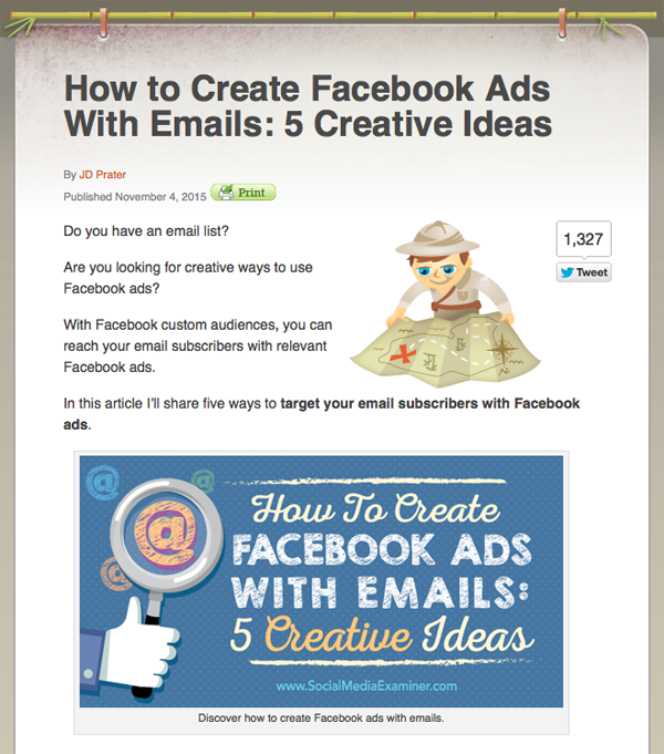
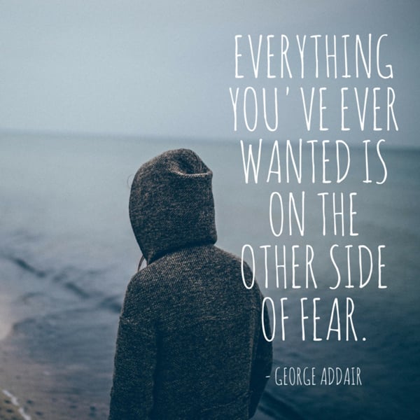
1) Graphical Blog Headers
Blog headers go at the start or just after the introduction of your blog post. They usually feature the headline of your post in an engaging, graphical form.
If done well, blog headers are incredibly effective because they pull your readers into the post, compelling them to devour the juicy content below.
And while the absence of a blog header won’t always deter people from reading on, a great blog header will all but guarantee it.
The team at Social Media Examiner have turned the use of blog headers into a bit of an art form, using them to kick-off their content and ensure readers stay directly engaged with it.
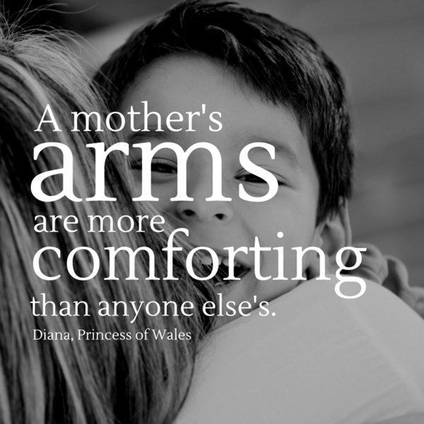
2) Social Media (or “Open Graph”) Images
Open graph images are the images that automatically appear when you share a link to a blog post on social media. You know, like this one:
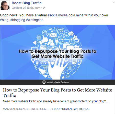
Sometimes they include the headline of the post, and sometimes they highlight some other detail, but the important thing is that they’re much more eye-catching than a text-only share.
In the months after Kobo first integrated with open graph images, it recorded a 50% increase in traffic and a 90% increase in registrations. Why? Because images add visual context to what you share on social media and evoke emotion in your audience, which significantly increase the likelihood that people will click through to read your articles.
Top-notch open graph images are also really simple to create. They don’t need a lot of design work, just a high-quality stock image, a few filters and the odd line of text. We’ll show you how to design these bad boys in the practical section below.
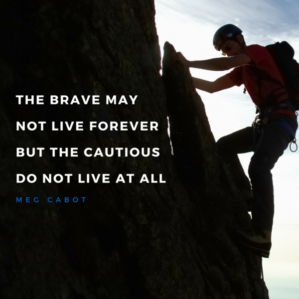
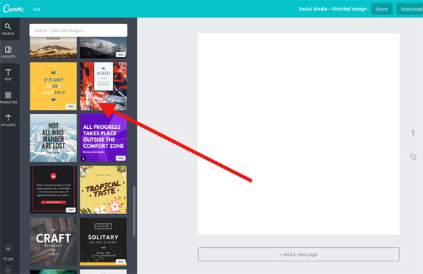
3) Typography Quote Graphics
The third image type you can create over and over to enhance your written content is the typography quote graphic – these nifty things:
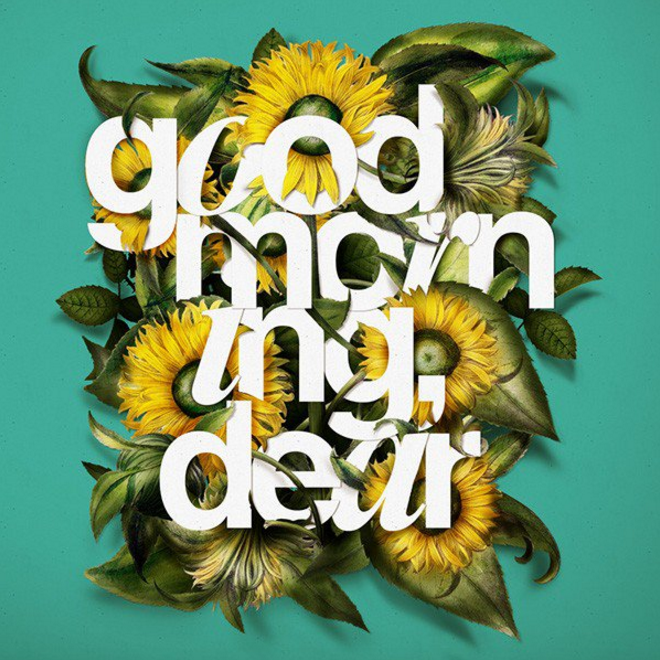
For a whole raft of reasons, blog audiences love typography quote graphics. (You know you do, too.)
With the right message and a stunning visual backdrop, they can move and inspire your readers while also appealing to a wider audience.
And they’ll drive traffic to any content they’re designed to promote. If you design one that goes viral, it can help your post go viral too.
These days, there are numerous graphic design tools (Crello, Easil, and Picmonkey among them) available to help you create eye-catching visuals for your website. Let’s walk through the ins and outs of one of them:
How to Create These Blog Graphics Quickly and Easily Using Canva
If you haven’t yet come across Canva in your blogging travels, your life is about to get a whole lot easier. To get started, make sure you’re signed into your Canva account or sign up for free.
You don’t need to understand the ins and outs of the platform to create the graphic types above – if you want to become a Canva pro, the quickest way to get there is to do the Canva design tutorials.
But we’re just going to cover what you need to know to get started.
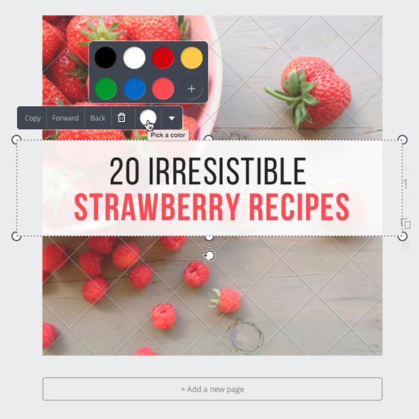
1) Creating Attention-Grabbing Blog Headers
Canva makes it super-easy to create attention-grabbing blog headers. If you’re already signed into Canva click here, or from the Canva homepage scroll down to the Blog Title design type. You’ll land here:
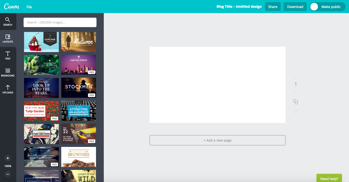
On the right is your canvas (the big white rectangle) and on the left is your design toolbar.
Your best bet is to customize one of the thousands of ready-made Canva layouts (those colorful things in between the design toolbar and the canvas). Some are free, while others cost a dollar).
Browse through or use the search bar to find the image that best fits your content and you’re halfway done. Then it’s just a matter of customizing the text for your own message.
But before you get too far down the road, here are our three golden tips for creating amazing blog headers in Canva:
Tip #1: Keep Background Images Simple
Remember what we said above about blog headers? Their purpose is to compel your readers to dive into the post itself – to get them scrolling.
Simple designs are the most effective for this because readers are more likely to engage with clean, uncluttered images.
So don’t worry about not having enough “going on” in your designs, or thinking they look too bare. The more open space, the fewer filters and the clearer the fonts, the better your results will be.
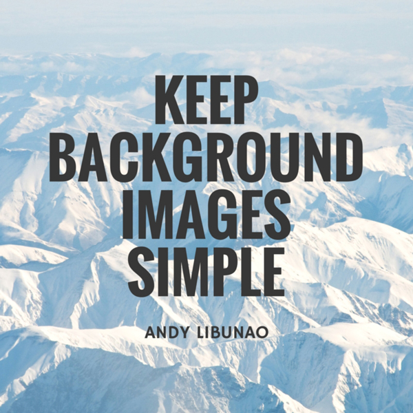
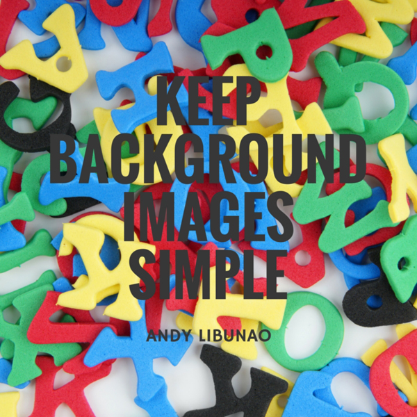
Remember, blog headers should compel, not confuse (like the one below).
Tip #2: Let Your Background Determine the Text Placement
Even though a blog header has a graphical background, the text is still the star. After all, you probably spent time carefully crafting your headlines and subheaders.
But that time will be wasted if the presentation of those messages in the blog header is muddled and unclear.
So you need to be very careful with your text placement.
Take a look at this image:

The trees at the bottom add weight and depth to the bottom half of the image and the text above them adds balance to the top.
Not only is this balance a good thing design-wise, but by placing the text in the space (and not directly over the trees) you ensure the design retains its simplicity and clarity.
By contrast, the graphic below fails to use the inherent balance of the image.

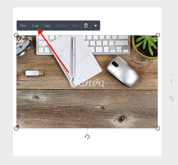
Tip #3: Crop to Create the Perfect Backdrop
Sometimes you’ll come across an image that feels perfect for your post’s subject matter, but it might be the wrong shape, include an element you don’t like, or lack enough free space or balance.
The simple solution to this? Cropping. Be discerning with the section of an image you choose to form the background for your blog header.
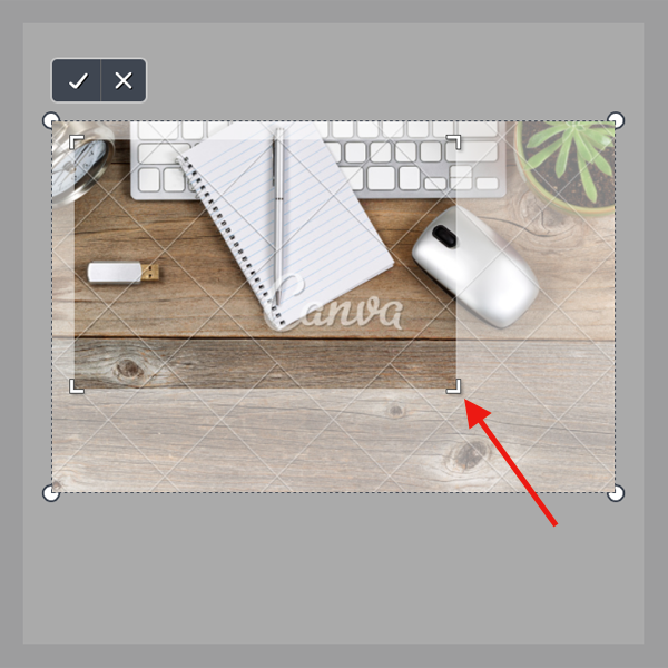
To crop, click on your selected background and then, click the “Crop” button on the toolbar that pops up.
Then, click on any of the four corners of the crop window and drag. Once you see the crop you like in the window, click the check button positioned above the image on the left.
2) Creating Open Graph Images that Make Your Content Super-Shareable
Canva also makes it easy to create engaging open graph images.
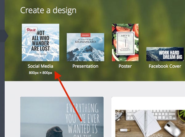
To get started, head to the Canva homepage and choose one of the Social Media Post design types at the top of the page.
Here are our 3 golden tips for creating attention-grabbing open graph images in Canva:
Tip #1: Use Emotional Imagery
The more emotions you can work into your image, the better. Research shows a direct correlation between the emotional content of an image, and how viral it goes.
If you’re not sure which emotions you should use, think of what your reader should feel in your post. In particular, what emotions are likely to be evoked by the headline?
Tip #2: Use Shareable Colors
Yes, there is such a thing as a shareable color!
While It’s important to have (or at least be working on) a consistent color palette for your blog, you can work certain colors into your images that will likely increase the number of shares your posts generate.
Research from Georgia Tech reveals that using pink, purple and red in your images promotes sharing. The trick, however, is not to make these colors the focal point. You don’t want to overdo it. Instead, you just want to sprinkle them through your image to emphasize important information. To make a colored text block a feature of your designs in Canva, make sure your color block and text colors compliment each other.
Tip #3: Use an Existing Template
This is a great place to start if you aren’t sure what makes a good open graph image for your audience. Play around with the professionally designed templates that are already laid out for you in Canva.
Change the fonts, backgrounds and colors until you find an image that works for you. Then test the result on your audience to see what types and styles seem to work best.
3) Creating Compelling Typography Quotes
To get started with typography quotes, choose the Social Media design type at the top of the homepage.
This type of blog graphic can be very popular on social media (and can supercharge your traffic numbers if you get one or two to go viral), but it’s crucial that you pay attention to the details.
Here are our three golden tips for creating attention-grabbing typography quote graphics in Canva:
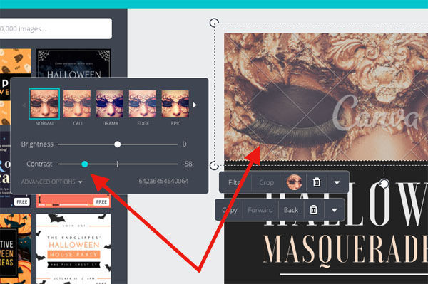
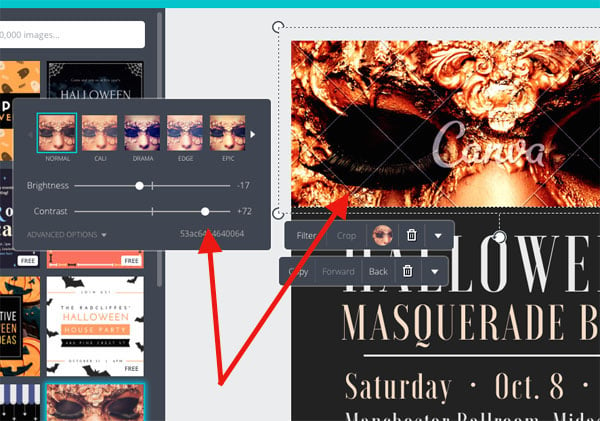
Tip #1: Harness the Power of Contrast Filters
The aim of a good typography quote graphic is to evoke some form of emotion in your audience. The quote itself will drive much of the emotion, but the visual side can enhance it.
For instance, contrast is a simple design technique, but if it’s used well it can really influence the mood and tone of your designs and evoke the emotion you’re targeting.
With contrast filters (like with so many design techniques), the best approach is to keep things simple – a little contrast goes a long way!
To adjust the contrast in Canva, click on the image you want to adjust and select “Filter.” Then drag the “Brightness” or “Contrast” sliders left to reduce the brightness or contrast of the image:
Or right to increase the brightness or contrast:
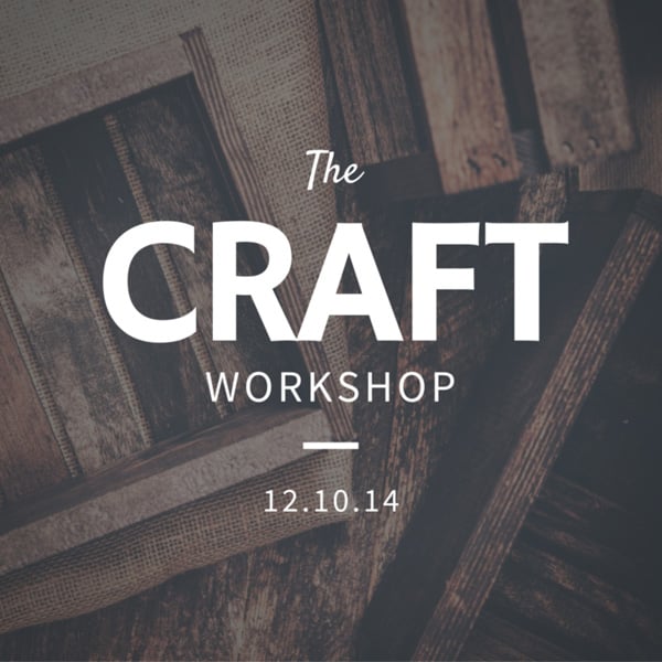
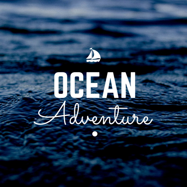
Tip #2: Choose Clear, Crisp Fonts
Don’t let your message get lost in a sea of fancy fonts.
Since typography quotes are as much about the message as they are about the design, you must ensure the text doesn’t take time to decipher, otherwise all the impact will be lost.
Focus on sticking to clear, crisp fonts that are easy to read. Save the fancier ones to add emphasis where it’s needed.
The focus in the image below is clearly on the power word CRAFT.
Below, the font used for the word Adventure intentionally draws the focus away from the word Ocean.
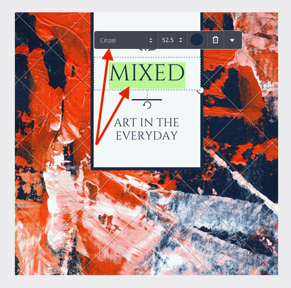
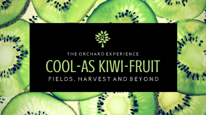
Tip #3: Use Colors from Your Background Image to Make Your Text Pop
This is a neat little insider tip that, if done right, can make the difference between a good and an exceptional image. And it’s so simple you’ll wonder why you never thought of it.
Try taking one of the more vibrant colors from your background and using it as your text block’s font color like we’ve done with the green in this image:
How to Get Moving Again if You Hit a Creative Roadblock
You’ve had writer’s block before, right?
Chances are you’ll get designer’s block too. It’s not always easy knowing how to get your message across visually, especially when design is a new world for you. All the available techniques and effects you can apply can get confusing.
Instead of bashing your head against the keyboard – or worse, just shrugging it off and giving up on using images at all – look for inspiration.
Chances are there’s a designer out there who’s already done what you’re trying to achieve with your designs, or something like it, and who can give you the perfect dose of inspiration.
Here are a few resources from the Canva Design School blog to get you started:
- The Power Of Hero Image Design: 35 Striking Case Studies To Inspire Your Own
- 70 Awesome Design Boards to Follow On Pinterest
- 50 Beautifully Illustrated Graphics With Tips To Make You A Better Designer
- 100 Brilliant Color Combinations: And How to Apply Them to Your Designs
Get Visual or Get Ignored
Whenever you think about blogging, you probably think about writing.
Increasingly, though, your words are just one part of the content equation.
In the popular blogosphere, visual is the new normal.
If your content doesn’t look great, your writing won’t even get a chance to impress, nor make money out of it.
But if your design skills are minimal (and your spare time is limited), it doesn’t mean you have to roll over and surrender to your more creatively inclined peers.
Learning to create the three simple graphic types above will put you right back in the game.
The more practice you get, the easier it will become.
And before long your “designer” hat will fit as comfortably as all the others you wear.
So don’t get left behind. Pick one graphic type and try it for your next post.
I promise, you won’t look back.
About the Author: With a background in advertising arts and illustration, Andy brings her graphic design lens to Canva’s editorial team. She loves combining her written and visual skills to help businesses find new and exciting ways to use design.
The post 3 Simple Blog Graphics You Can Create (Even if You’re Not a Designer) appeared first on Smart Blogger.